Solving problems and working together can be tricky business—but sometimes the answer is in loosening up and having some fun. From bean bag tosses to shared self-portraits, projects from Assistant Professor of Interior Design Irina Schneid’s course, Interplay: Ethics and Tactics of Co-Design, show a range of creative, collaborative, and sometimes even silly ways to build relationships and work together.
Schneid first began teaching it in 2022. An interdisciplinary course in the School of Design, Interplay brings undergraduate and graduate students across programs together to build community. “We use play and gamification as a way to teach students the foundational building blocks of working together with one another and also with community members beyond Pratt’s gates,” said Schneid.
Each semester, students in this class team up to design an installation, or “InterAction,” within Steuben Hall and Pratt Studios. The project must be something that the larger Pratt community can interact with or participate in. The project is designed to spark moments of joy, reflection, empathy, or connection.
Teams start by thinking about and sharing their favorite childhood games with one another. Next, they explore the qualities that make each of the games fun, interesting, or successful. After that, they work together to combine parts of their games together to create a new game or interaction. The process gives students hands-on experience with creating engaging, accessible experiences as a team.
Take a look at some of the playful projects from the last five semesters below!
Fall 2024 InterActions – On View Now!
CO-FLICKt: Competition Meets Community
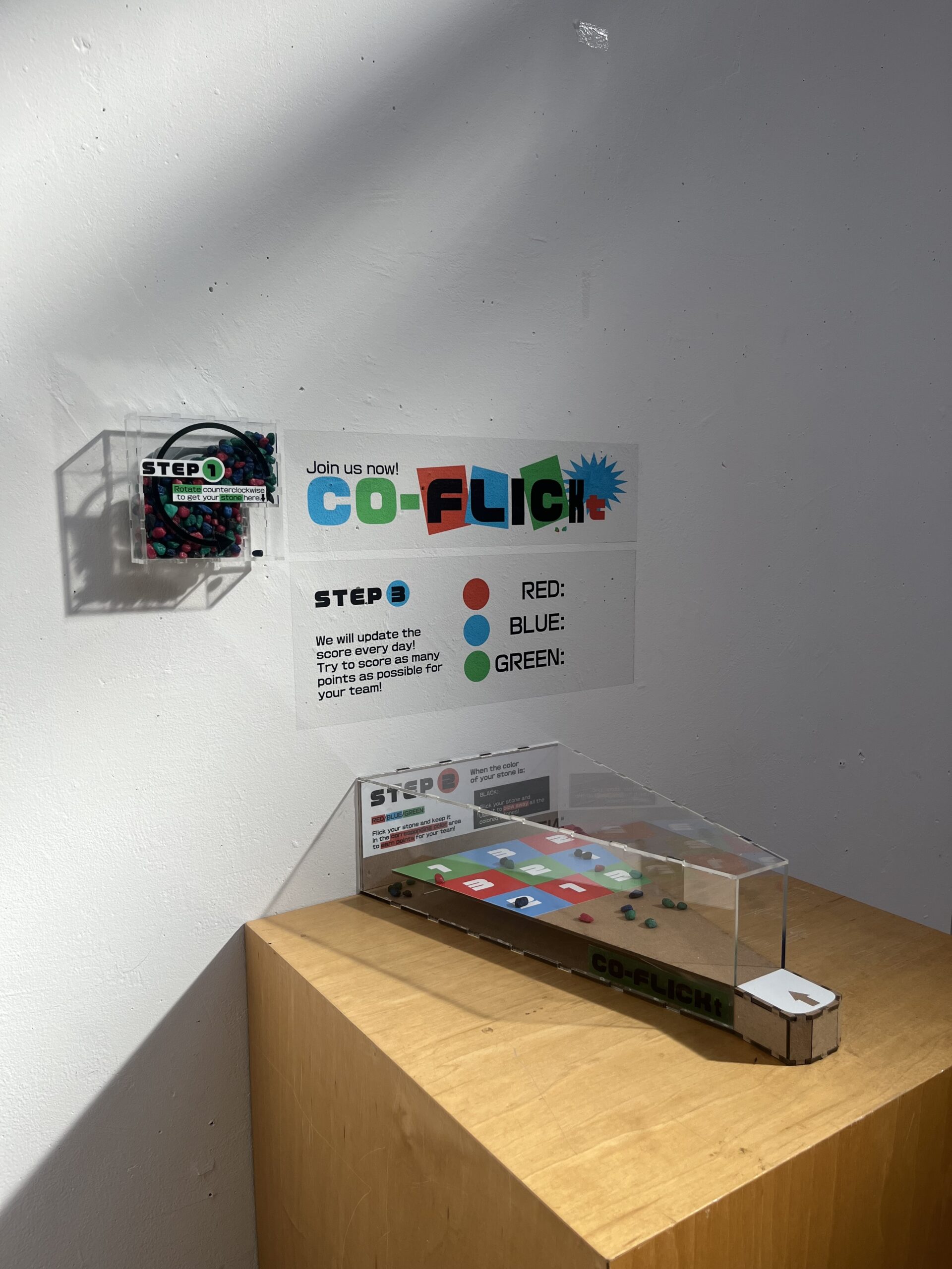
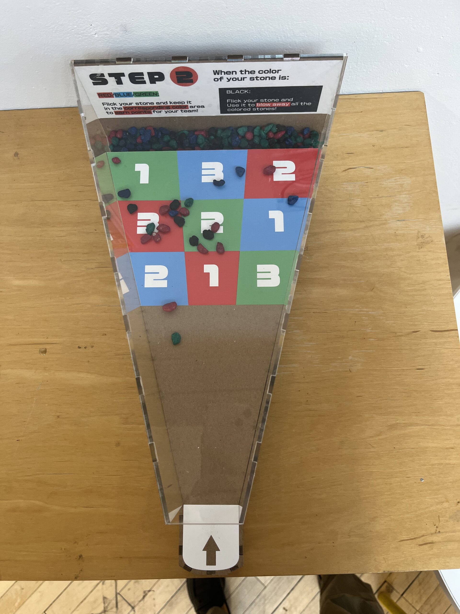
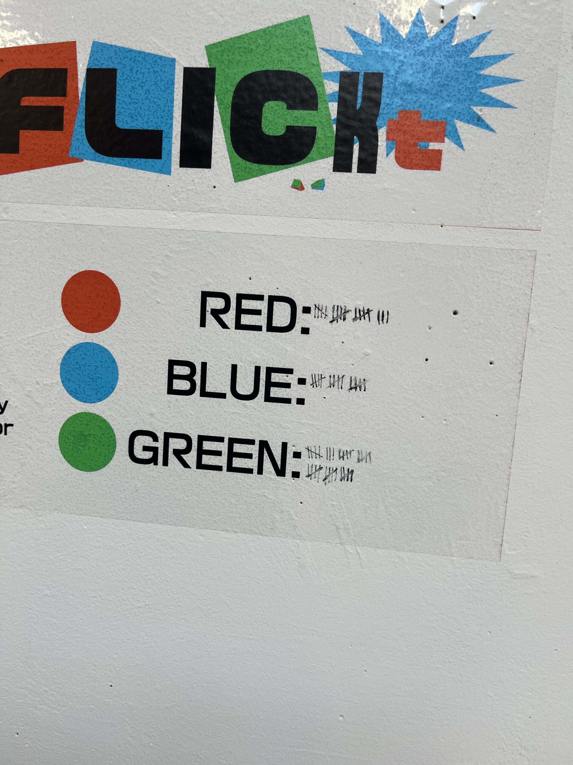
Sajjad Musa, MFA Communications Design ’26; Molly Wasserman, BFA Interior Design ’25; and Yichi Zhang, MFA Communications Design ’26, brought together elements of their favorite childhood play to create a game that includes collective point-keeping, technical skill, and strategy. CO-FLICKt encourages friendly competition between players who attempt to flick colored stones onto the board’s different zones, earning points for their color team. Since points are earned over time, the game creates a sense of camaraderie with your team, even if you don’t know who they are or don’t play at the same time.
“It was really cool to see that the intent—which was joining this bigger team that’s greater than even the people you know—was actually coming into effect just later that [first] day,” said Wasserman. “I think the biggest takeaway was that having a very quick activity can engage—or create a sense of—a larger community, which was super cool to see in action every time I walked by.”
COMMUNITY CANVAS: Visualizing Shared Values
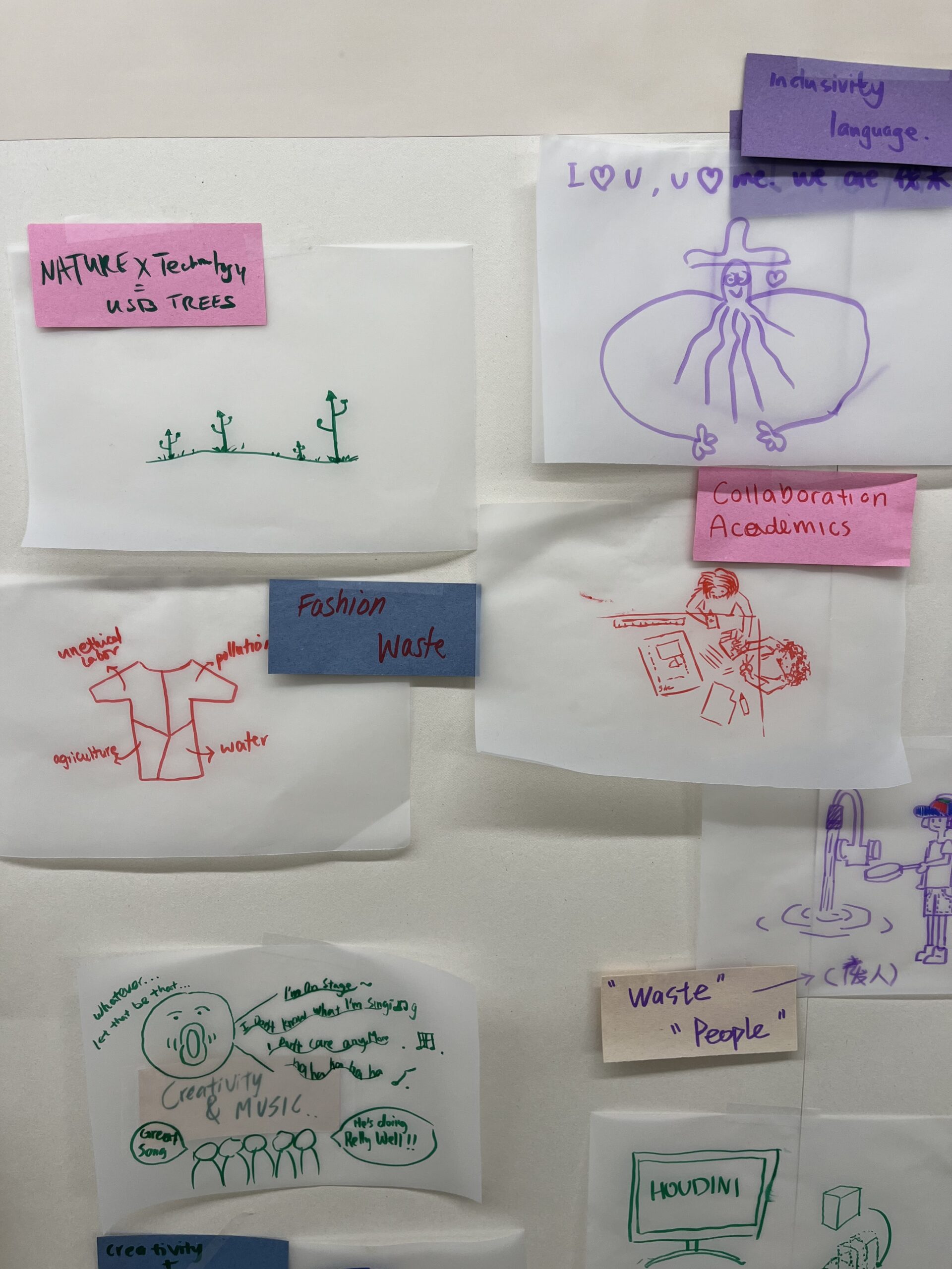
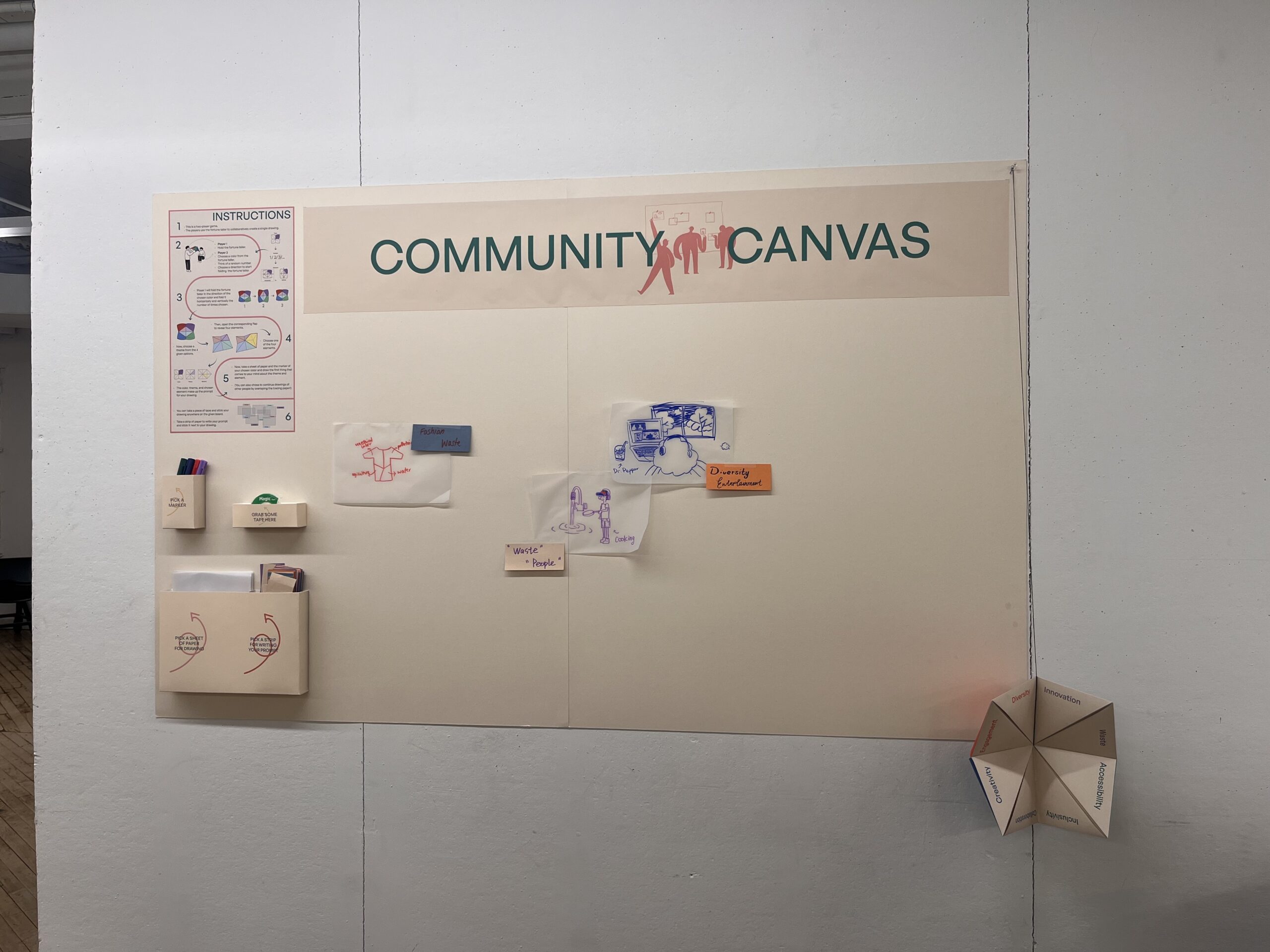
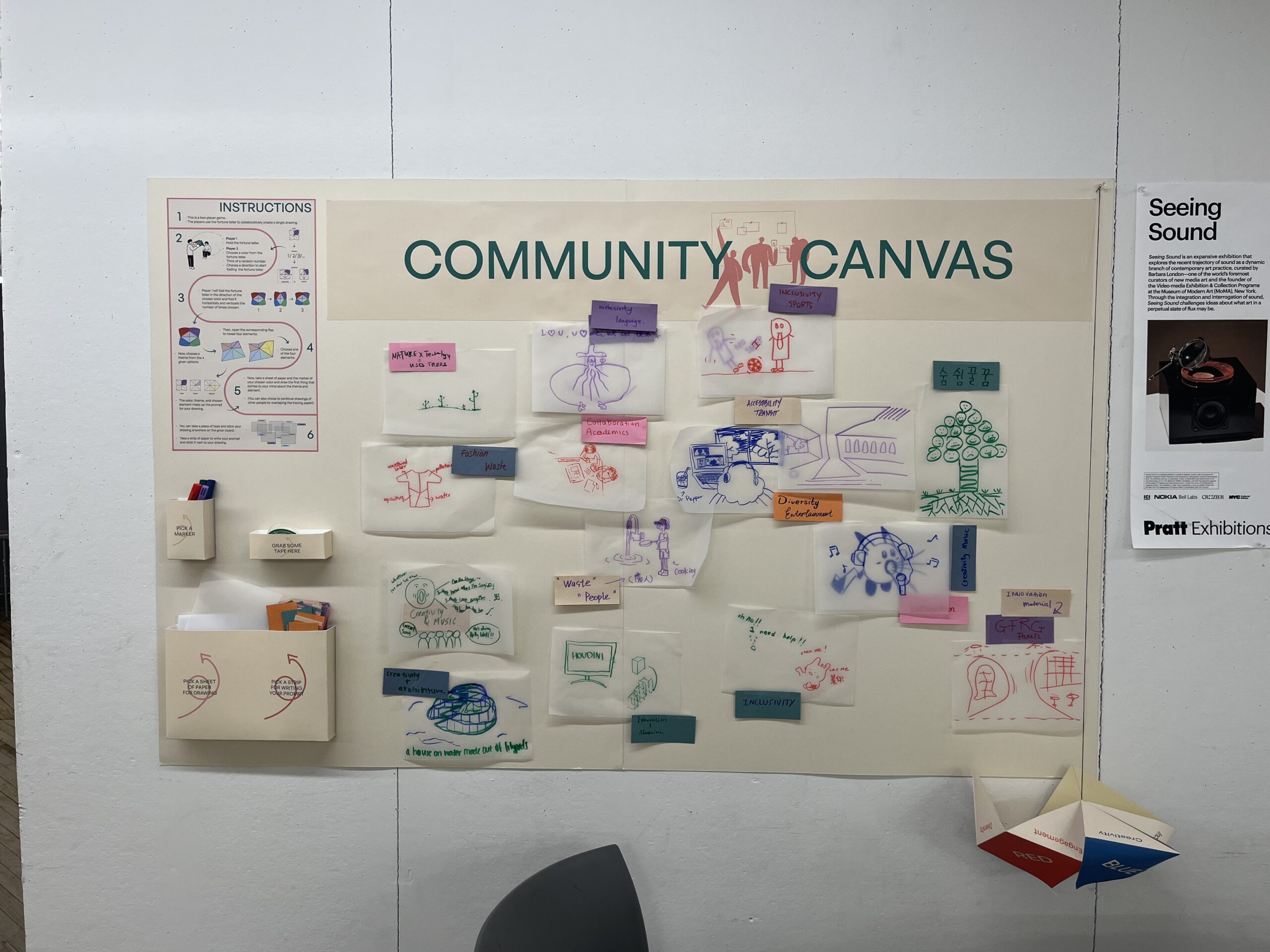
Through word association prompts, Community Canvas by Devyani Goyal, BFA Communications Design ’25, and Jingwen Zhang, MFA Interior Design ’28, encourages people to literally and figuratively draw connections between School of Design values, including accessibility, inclusivity, waste, collaboration, and sustainability, and design topics such as transportation, food, and fashion. As more people add their sketches, the canvas fills up with visual reminders of the community’s shared values and concerns.
“Working with students from different departments was a great learning experience for me,” said Goyal. “It is also interesting to see how people from different disciplines approach projects with different constraints—like for me as a graphic designer, I generally think about the visual aspect first. While my partner, who is an interior design major, approached it from the viewpoint of the physical dimensions and materiality aspects.”
Projects from Previous Semesters
TILT: A Maze Made for Two
For the fall 2023 semester, Eliza Corderman, MFA Fashion Collection + Communication ’26; Abigail Hoover, MID ’25; and Allen Liu, BFA Fashion Design ’25, created Tilt, a hands-on game in which partners try to guide marbles through a maze by holding and tilting the board. Inspired by Set, Uno, and 3D Puzzle Ball, the game encourages team problem-solving and provides a moment of light-hearted play.
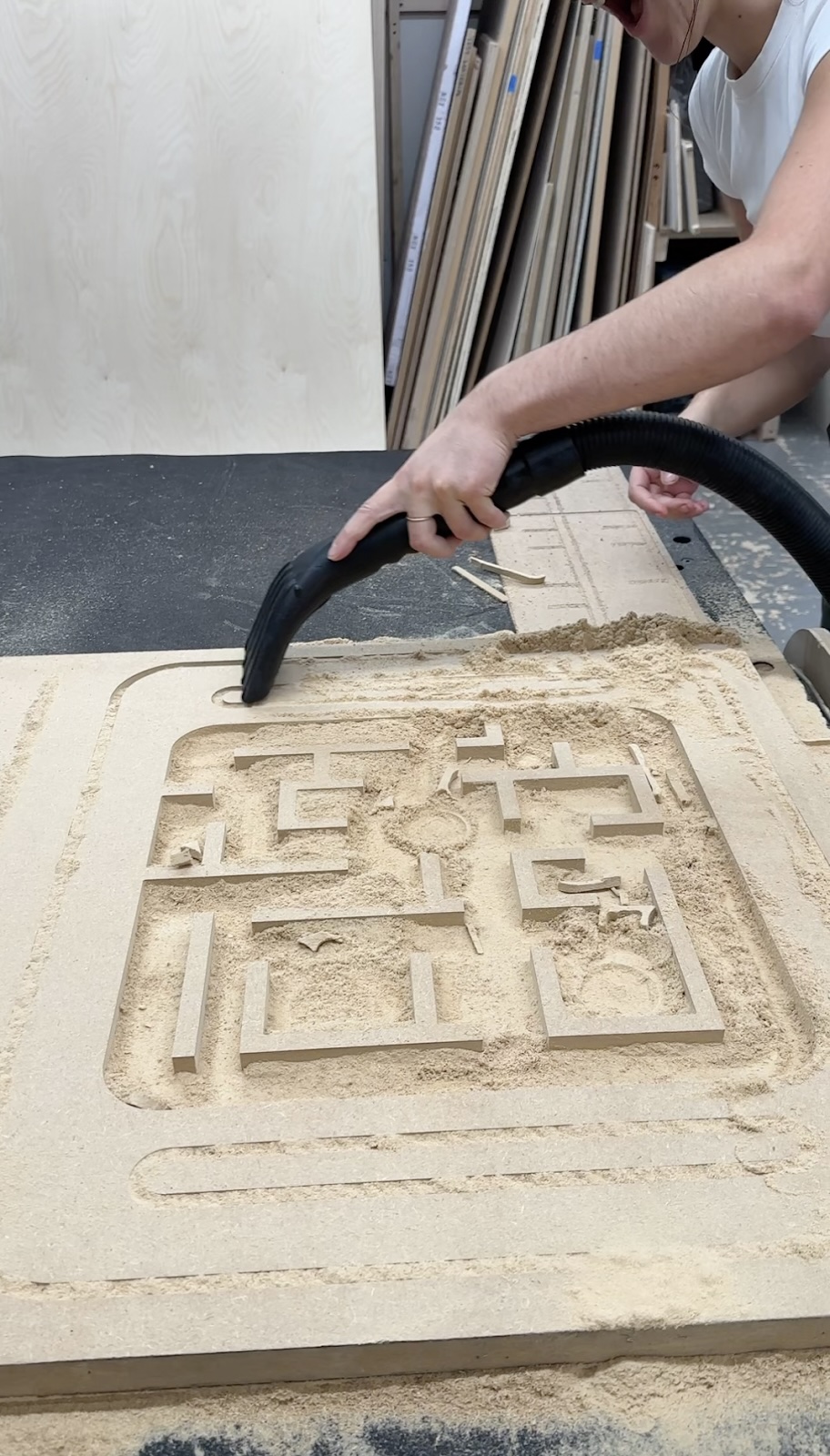
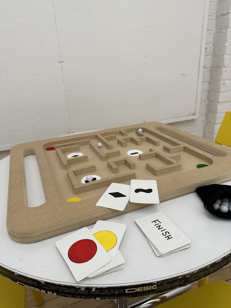
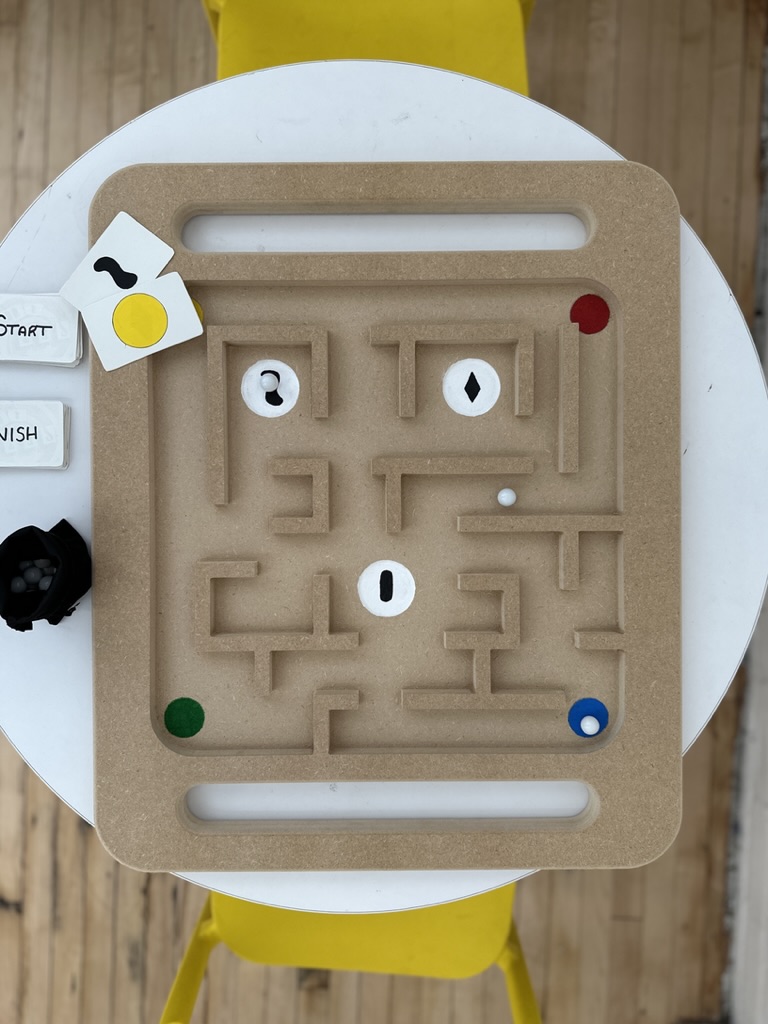
Tilt by Eliza Corderman, Abigail Hoover, and Allen Liu.
LEGO LOG: A Month of Moods
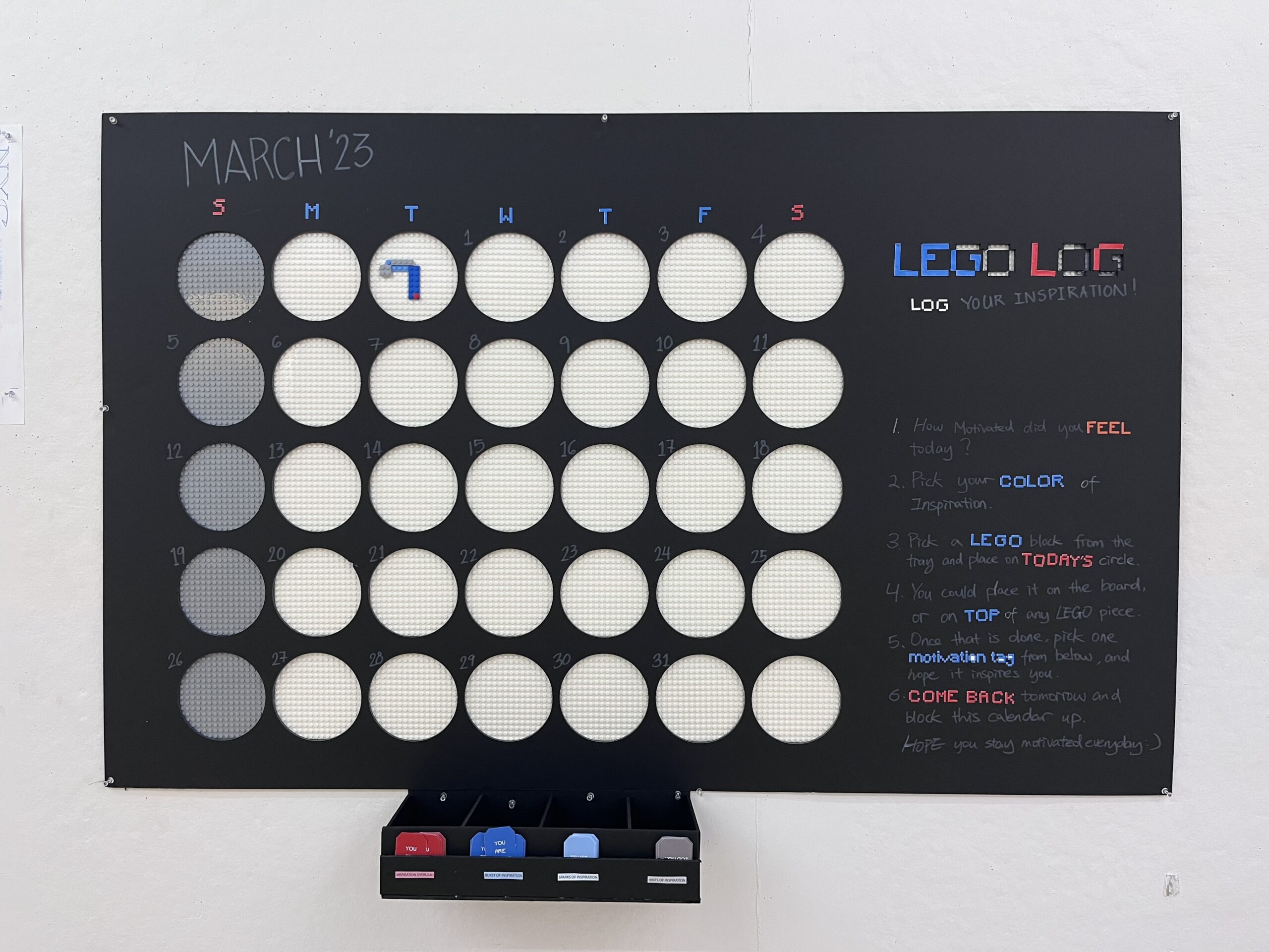
Priyashi Mehta and Yuying Zhu, both MFA Interior Design ’24, came up with a build-your-own lego mood calendar. Lego Log tracked not only the days of the week but also how motivated members of the Pratt community were feeling each day. Lego Log used the toys most often associated with childhood to encourage low-stakes creativity. By the end of the month, the calendar was covered with colored blocks, bridging across days, and resulting in a unique collective mural.
KNOT IN THE MOOD: A Tapestry of Emotions
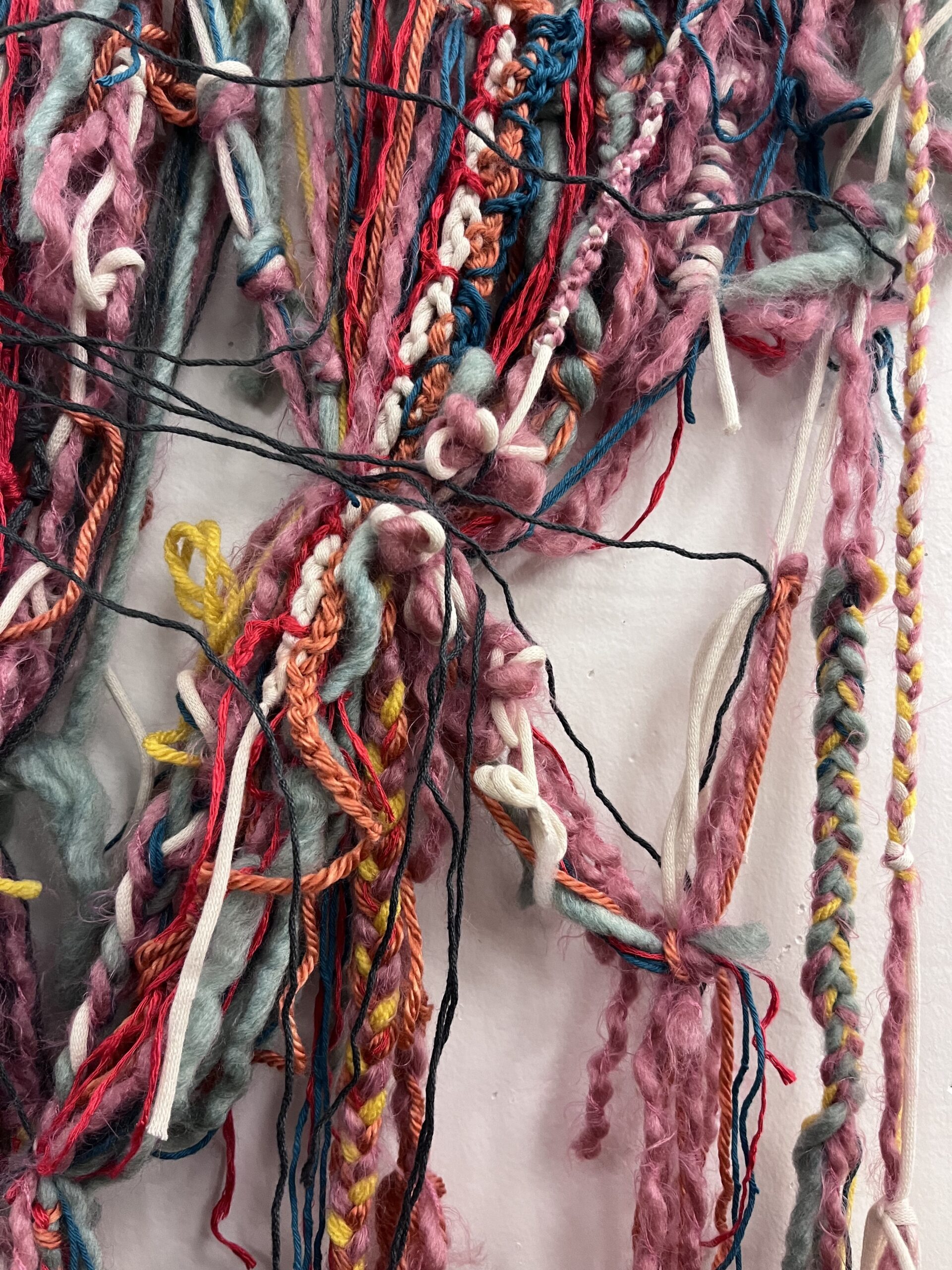
Knot in the Mood took a softer approach to tracking shared emotions. Designed by Sara Cui, MFA Interior Design ’23, and Luyao Tang, BFA Fashion Design ’24, Knot in the Mood encouraged passersby to select and weave an emotion-coded yard into a growing network of community threads. While not a game, the interaction provided a powerful representation of the changing emotions of people within the School of Design.
Inter-PLAY!: Bean Bag Stress Relief
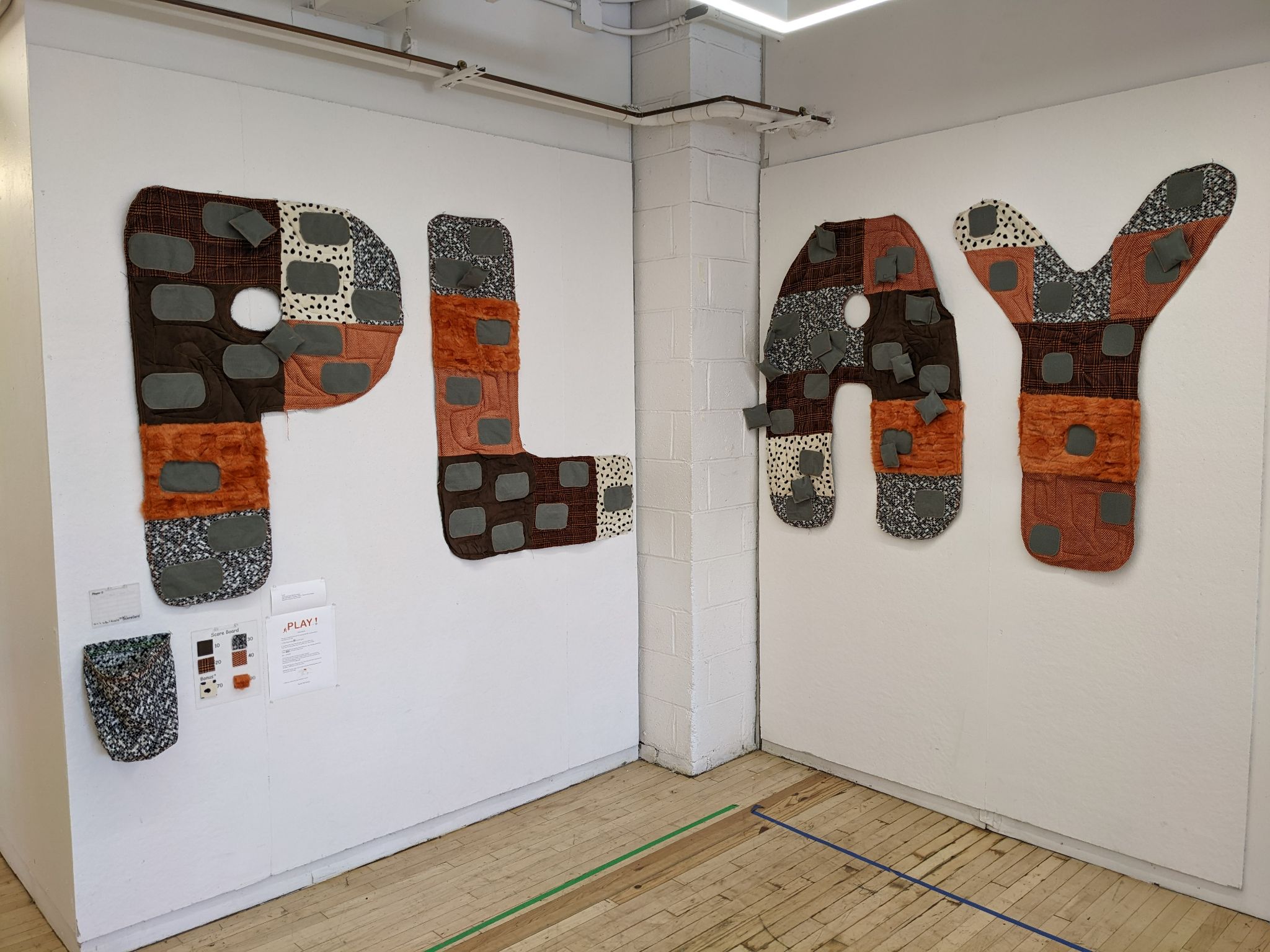
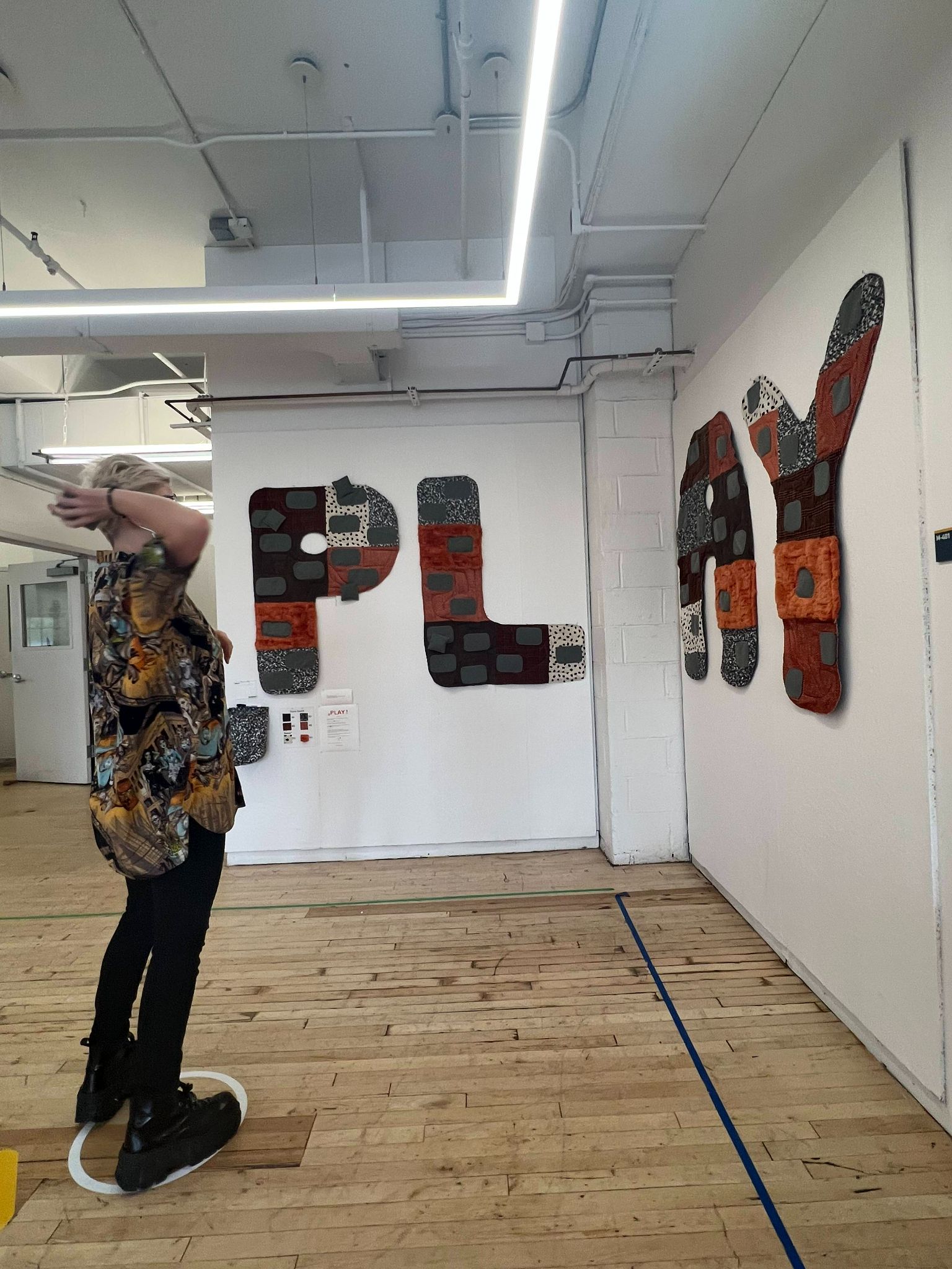
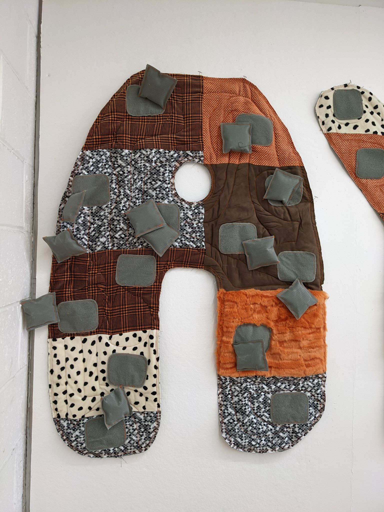
For those looking for something more active, Inter-PLAY! gave people a chance to get their frustration out. Designed by Mallory Huang, MID ’23, and Aimee Schmale, BFA Fashion Design ’23, Inter-PLAY! invited people to throw bean bags at the large fabric letters on the wall. The goal was to get the beanbags to stick to the velcro on the letters. Schmale was able to use her fashion skills to hand-sew the letters together.
OUR COMMUNITY PORTRAIT: Reflecting Who We Are
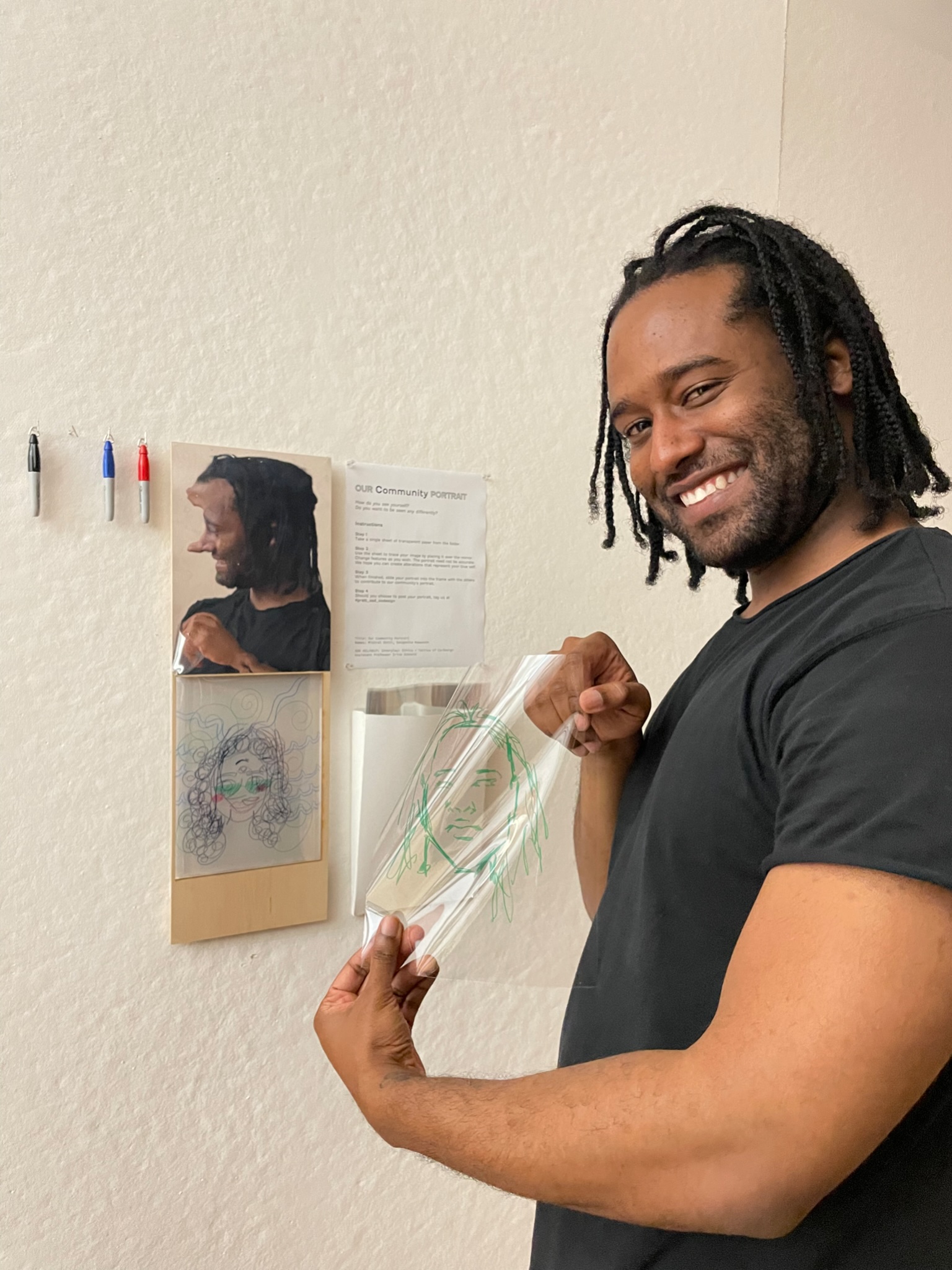
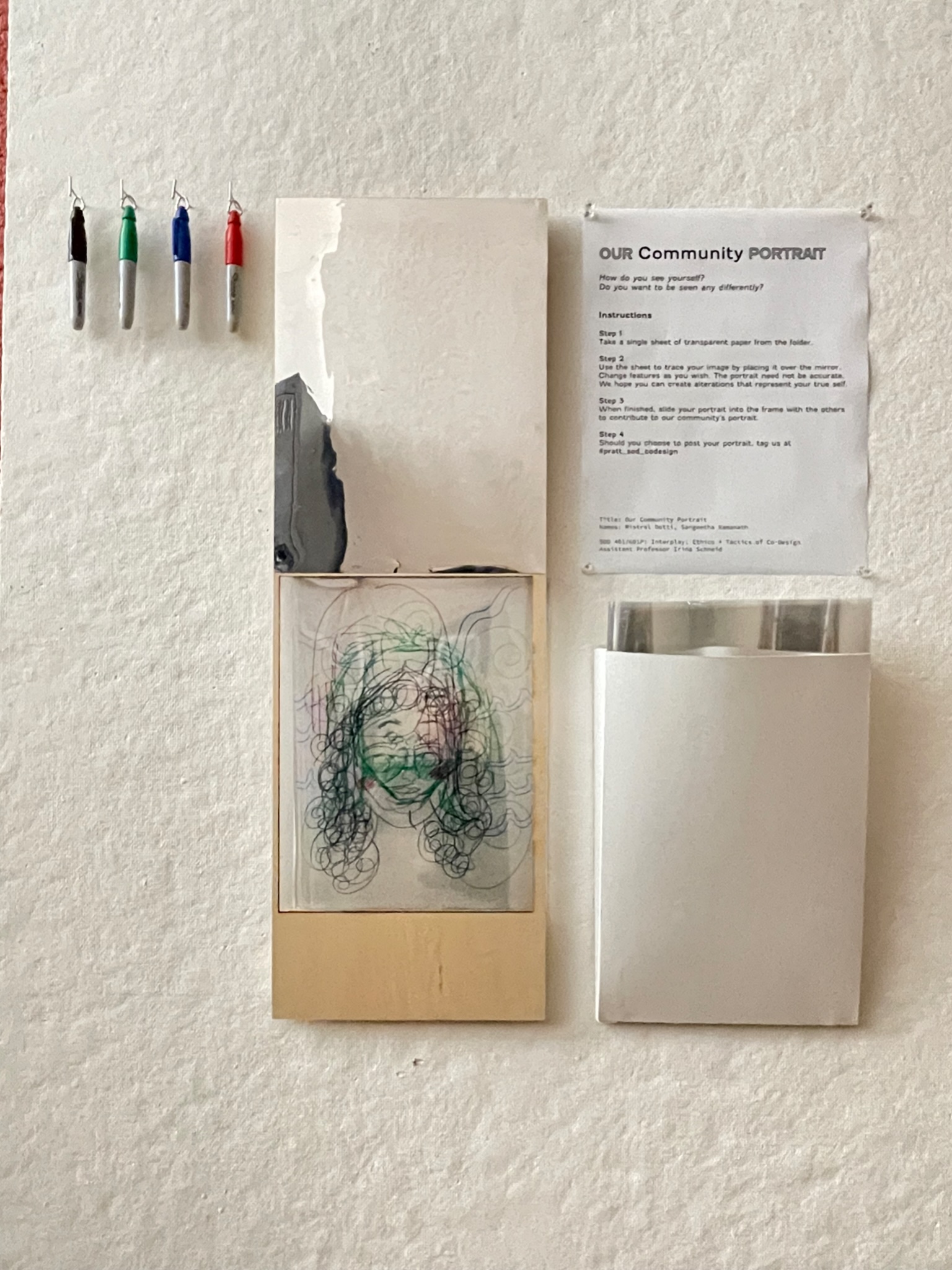
Sangeetha Ramanath and Mistral Dotti, both MFA Communications Design ’24, turned the idea of a self-portrait into a shared activity. They hung a mirror and sheets of transparent paper on top of it. People were then encouraged to trace their reflection and adjust it to reflect how they wanted to be seen rather than how they were typically perceived. When layered on top of each other, they created one large shared communal portrait.
Keep an eye out for more InterAction projects coming spring 2025!
